Chris Yonge's notes on visualization, animation, and video. I work with creative professionals facing the challenge - and opportunity - of communicating 3D concepts to markets, suppliers, teams, and juries.
Monday, November 15, 2010
Saturday, September 18, 2010
Stop motion advertisements
Two beautifully made stop motion advertisements for Brother printers from the UK designer Noah Harris.
Wednesday, September 15, 2010
Horizonless projection of Manhattan
These horizonless perspectives of Manhattan, reminding one of the interior of the cylindrical spaceship in Arthur C Clarke's story "Rendezvous with Rama", were created by James King, a British designer, for the design consultancy BERG. A more detailed discussion of the project is here.
Saturday, September 11, 2010
Public visualization
A beautiful example of data - in this case a fire station's callouts - presented publicly as mural art. Why don't more public bodies do this?
Monday, September 6, 2010
Saturday, September 4, 2010
How data changes how we live
The UK Daily Telegraph has an article showing ten ways in which innovative data collection and presentation is changing the way we live. It includes a link to the UK Government's new open data site, something I'll look at more closely in a later post.
Thursday, August 26, 2010
Yes we Canberra
Patrick Clair's satirical animation of Canberra as composed entirely of infographics was made for the recent Australian election. Great timing and animation.
Tuesday, August 24, 2010
New York Times graphics
Matters of Principle
Not an infographic or an animation, but simply an elegant Flash interface to Gary Hart's blog Matters of Principle.
Monday, August 23, 2010
Rock, paper, scissors
A simple, entertaining Rock Paper Scissors infographic which illustrates many of the points of a good instructional diagram: intuitively accessible images classified by color and shape, simple wording, a clear course (yet with the option for the leisured reader to pursue sidebars), a strong implied story, and logical development through the course of reading. Ending with the left field "Spock move" introduces humor and surprise - and helps retention - without taking away from the value of the piece. The equivalent of a page of text but faster - and probably more effective. Don't overlook the Download Full Size option to print it out for fledging RPS players in your circle.
Saturday, August 21, 2010
Siggraph 2010
This three minute trailer for last month's 2010 Siggraph Animation Festival gives an idea of what's possible in animation today. Siggraph, for those not familiar with it, is the the Association for Computing Machinery's Special Interest Group on Graphics and Interactive Techniques, and its annual conference is the leading US forum for animation professionals and researchers. A dozen of the short, stunning pieces in the Animation Theater are also shown here.
Friday, August 20, 2010
Well formed data
This intelligent post on well-formed-data.net neatly paraphrases a longer article on acm.interactions.org, and in an engaging and concise fashion describes the useful concept of propositional density in information design. Most graphic and information designers are aware of the field-ground duality in the FedEx logo (the arrow defined by the E and the x), but this draws on that example to propose a general classification of design quality. I have long been an advocate of elegance in design, but seldom able to describe it as well as in this post. The links, if you have time, are also worth following. A recommended 120 second (minimum) read.
Wednesday, August 18, 2010
Illustrated Guide to a PhD
Computer science professor Matthew Might's Illustrated Guide to a PhD. A perfect visualization of a non-intuitive concept. But read right to the end to get the real, really poignant, point of it all.
Monday, August 16, 2010
Invest in Girls
Not so much an information graphic as a well done visualization of a powerful and true message. So much can be done so simply in just over two minutes. The Girl Effect.
Sunday, August 15, 2010
BP infographic animation
A video from BP showing how the relief wells for the leaking pipe in the Gulf are being drilled. This is similar in some ways to what Studio Cruz created for Potter Drilling (which can be seen here) but shows an actual rather than an idealized case. The technology is amazing: drilling a hole a mile underwater through three miles of solid rock to intersect a ten inch diameter pipe. The video is a good example of how informative animation can be used to explain concepts, not only to the public but also to the drilling crews themselves. About six minutes in all.
Saturday, August 14, 2010
New York Times graphics
A podcast documentary on the development of the award winning interactive graphics at the New York Times on the publishing site Gestalten.tv.
Wednesday, August 11, 2010
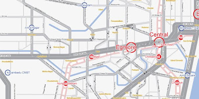
KickMap
A fascinating article from O'Reilly Radar on the development of KickMap, an innovative map of the NY subway system. In it, the designer, Eddie Jabbour, writes a personal and engaging history of the NY subway system map and his self-imposed project to redesign it. Much of what he writes is applicable to any kind of visualization of topography and location based information, but he admits to designing from the political perspective of wanting people to take public transport rather than their cars. Jabbour is painstaking in following the experiences of potential users of his map; something of a classic story about information design with a purpose.
Monday, August 9, 2010
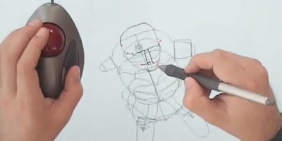
Everybody Loves Sketch
Everybody Loves Sketch, a more polished 3D computer sketching concept than Rhonda, has a development video online here. But still no word if or when it will be available after a year online. In its six minutes it makes clear, if only by implication, how difficult it is to create an intuitive 3D sketching interface based on a 2D interface.
Previsualization
A well produced nine minute documentary video about the art of previsualization from the Previsualization Society. Previz, as it's commonly called, helps directors and the creative team optimize story, scenes, camera angles, lighting, and effects for movies and short features. Previz animations are a part of the creative process that is seldom seen by the public, but one where individual animators have a significant impact on the final result.
Sunday, August 8, 2010
Rhonda
Still on the subject of sketching, Rhonda offers one of the best options for 3D ideation on the screen. Finding an efficient and intuitive interface is key: on the one hand the program can't make so many assumptions that it gets in the way of what the user wants to do, on the other requiring them to make too many choices is equally distracting. Perhaps a continual gradation between the two, changing naturally as one racks up hours in the program.
Saturday, August 7, 2010
Extracts of Local Distance
A four minute video about a curiously fascinating German project that deconstructs architectural photographs and reassembles the pieces in new perspectives. Extracts of Local Distance, with its suggestive assemblies of elements, offers a glimpse of a future ideation tool as powerful as sketching.
Labels:
architecture,
elements of local distance,
ideation,
sketching
Wednesday, August 4, 2010
Street Slide
Street Slide, being developed by Microsoft Research, is a next generation immersive cityscape viewer with potential for both commercial and social linkages. Note in the video the seamless way the interface combines the best features of existing static image bubbles with the new paradigm of the sliding viewer.
John Maeda
John Maeda's web site. Maeda studied at MIT and is currently President of the Rhode Island School of Design. The Java calendars he created for Shiseido in 1997 are some of the most elegant software timepieces ever made. Try Umiaki Calendar, Hanabi Calendar (hint: light the numbers with the match - hanabi is Japanese for fireworks), and Line Calendar.
Monday, August 2, 2010
Crime as elevation maps
A simple but effective idea: to show various types of crime in San Francisco as elevations. Because there are multiple independent variables influencing reporting (actual crimes committed; intensity of police presence; local tendency to report crimes) this is more decorative than useful. How could one add the other relevant variables in a distinctive dataspace? Color? Luminosity? Texture? An animation showing patterns in space over a normalized 24 hour duration would be interesting.
Friday, July 30, 2010
Hacking data in India
The UK Guardian newspaper has this interesting article about Prime Minister David Cameron taking a group of data hackers to India to teach - and learn - about crowdsourcing data to create new, accessible visualizations.
Thursday, July 29, 2010
SpiraClock
An interesting new clock paradigm is described in a PDF document here; others are on the German site Informationsvisualisierung.
Tuesday, July 27, 2010
Between the Folds
Nothing at all to do with information, but Between the Folds is a wonderful fifty minute documentary about paper folding in art, science, and imagination. For those of you with Netflix accounts it's available for streaming download here; for those without, try to see it if you can.
Sunday, July 25, 2010
3D mice
Over the last couple of years I've become a convert to 3D Connexion's range of 3D mice. These more than double your productivity in any 3D application (such as Studio Cruz' stable of SketchUp, Rhinoceros, SolidWorks, and 3D Studio Max) by allowing both hands to be used - the left to manipulate the model/viewpoint and the right to create and edit detail. Though the top end model shown above is $400, the basic Space Navigator model can be found online for under $60 and has all the essential ability to spin, pan, and zoom of its big brother.
Edward Tufte
For those not familiar with Edward Tufte, the leading critic and developer of information graphics, his site is here. An enormously influential and talented designer and brilliant presenter; I well remember the two courses of his that I have attended.
Thursday, July 22, 2010
How Google works
Fresh, informal, informative graphic from PPC on how Google works. The scraps of paper, "handwritten" font, and drawn arrows can all be created electronically for flexibility in editing and revision. Many free handwritten fonts are available, such as the one on this page or here.
Sunday, July 18, 2010
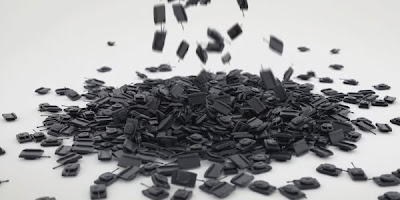
Moustache visualization
Data visualization animation from Paris studio Moustache: a nicely rendered animation/physics simulation that should work. But it is only partly effective because the number of tanks seems closer to eight thousand than eighty eight thousand. I'm sure it's accurate, but appreciating that number is difficult; the designers needed to understand viewers' perceptions more than has happened here. Using 3D to communicate amounts is difficult because our minds do not intuitively comprehend comparative volumes as immediately as areas and lines. Suggestion: have the tanks fall down and stack between two transparent planes, one tank thick like a Tetris game, to better show the numbers and the waste involved.
Ruby library for SketchUp
The Ruby Library Depot, maintained by a laboratory of the École Nationale Supérieure d'Architecture de Nancy in France, has many of the scripts developed by the SketchUp community over the last few years. A good place to start when you need to extend SketchUp's functionality for a particular project.
Saturday, July 17, 2010
Thursday, July 15, 2010
Skateboard video
A city becomes a skateboard park in this video for Ubisoft’s Shaun White Skateboarding video game by Rabbit.
The Art of the Title Sequence
Setting the tone of a movie while listing cast and crew: the same challenge as retaining a viewer's interest while communicating the core information in a visualization. Art of the Title shows examples of the best title sequences in current cinema, with not just screenshots but SD and HD QuickTime video.
Wednesday, July 14, 2010
Google climate map
This article in the UK Guardian today describes a Google climate map produced by the UK government Hadley Climate Center. You'll need Google Earth installed to see it; when you do the well designed KML file is here. An elegant integration of overlaid large scale graphics, video, and links.
Tuesday, July 13, 2010
Anchored
Another wonderful thesis animation from Ringling School , heavier on editing than yesterday's. Synch with the music track is effective and subtle, very strong story underlined by animation, words, and music.
Monday, July 12, 2010
Departure of Love
Fun, stylish, simple animation from an award winning graduate of the Ringling School here. See if you can guess the twist in the tale before it happens.
The Olivetti Lettera 35
I was struck by this typewriter when I first read an article about it in the UK magazine Design, around 1975. Yes, 1975. I bought one as soon as I could and utterly fell in love with the design, the elegance, the quality. I typed entire books on this machine. It was designed by the great Italian designer Mario Bellini, and after many years of use and thousands of miles of travel sits in a place of honor in the studio in Santa Cruz. No, I don't now use it every day (though it is still unrivaled for fast labeling), but each time I see it I appreciate it. Art that works. Design.
Bathsheba, the Rhinoceros, and Google Earth
Santa Cruz artist/craftsperson Bathsheba Grossman uses Rhinoceros and SLS (selective laser sintering of metals) to produce sculptures of mathematical concepts. Unique and wonderful.
And McNeel has developed an export plug-in for Rhinoceros to save out KML and KMZ files with geolocation. This completes a comprehensive model/presentation software group consisting of Rhino-SketchUp-Google Earth, plus any competent image editor for textures.
Saturday, July 10, 2010
Information is Beautiful
Fascinating site, a favorite of mine, on the presentation of information. Always fascinating, often stunning: Information is Beautiful.
Friday, July 9, 2010
Post-It stop motion animation
I couldn't resist it. Three months of planning, four days of shooting, and six thousand Post-Its later ... this.
IDEO Living Climate Change winner
The winner in IDEO's recent Climate Change Video Challenge. IDEO asked entrants to show a vision of the future affected by climate change; the winning entry, “We Make It_Spaghetti Bolognese,” is here. Simple, effective use of low resolution green screen video.
Wednesday, July 7, 2010
Woodworking plugins for SketchUp
SketchUp is inspiring a varied collection of Ruby plug-in writers. As a former professional woodworker, Wudworx' collection caught my eye. It's now possible to create a seamless progression of derivatives from a SketchUp model: from working drawings, renders, animations, and sightline/shadow studies up to Google Earth geolocation and tours.
Tuesday, July 6, 2010
Stop motion environmental animation
A great environmental animation on the origin of life, the Universe, and everything at http://vimeo.com/13085676, full of ideas and imagination and movement, jumping from surface to object and back again. Worth the investment of ten minutes just to see what's possible in this medium with a lot of time, paint, inspiration, and perspiration.
Thursday, July 1, 2010
Animation
Fast, engaging animation from the Renaissance Society of America illustrating Daniel Pink's theory on what motivates us as employees and people - www.youtube.com/watch?v=u6XAPnuFjJc. But does the animation underline what he says or distract from it? Would this be the same for everyone? I happen to think it works because I had to watch it twice - once to be distracted by the animation, the second because I missed points in the argument as a result. Maybe that's the reason it's stuck in my mind.
Wednesday, June 30, 2010
Branding and logos
When on a deadline for a design project and the client is slow to provide collateral, I often visit Best Brands of the World's web site. They provide free downloadable vector logos, more often than not including those of the client I'm working with. It's one of those essential sites I keep in a bookmark folder called Resources. Take a look at it here and see if it works for you.
Tuesday, June 29, 2010
Robert Lang
This has nothing to do with computers or sketching, everything to do with the representation of forms in a medium one might think unsuited to solid modeling - paper. A wonderful site for anyone who loves the marriage of mathematics and craft. http://www.langorigami.com/
Google SketchUp blog
A post illustrating the potential of SketchUp Pro's Layout feature for a small visualization consultancy from the SketchUp blog here. SketchUp Pro may seem expensive ($495) since it's possible to do so much with the free version, but that extra 20% functionality gives it 80% more power.
SketchUp is tightly integrated with Google Earth; the ability to exchange information between the two - and the possibilities this generates - will be the subject of a Studio Cruz event in July or August. A SketchUp model of the studio is shown above.
Subscribe to:
Posts (Atom)